Client
Project
RESHAPE THE LANDSCAPE FOR DIGITAL PRESERVATION
Project length
September 2019 - Current
RESPONSIBILITIES
Lead UX Designer
User interface designer
UI design
Art direction
R&D team leader
Marketing support
- Other case studies:
- Preservica
- AgSpace
- Zift Solutions

So, what does Preservica do?
Mission statement: The world's cultural, economic, social and political memory is at risk. Our mission is to protect it.
Digital preservation offers significant advantages when it comes to preserving information and ensuring its accessibility over time. Imagine wanting to read the Doomsday book, a historical record of land ownership in England, in 100 years. With digital preservation you can preserve file formats even when they become obsolete.
Building a habit forming product
Challenge: With over 300 customers already using the legacy system I had to find a way to make the new app work in synch without too much conflict. How might one design a preservation app that people fall in love with in less than 12 months? The legacy application was very complex and a rewrite would take years but we had to release an elegant MVP to test the market. With no existing analytics I had to start blind and relied on a small group of users who helped me test my hypothesis. Our current user base was for enterprise businesses and this new app would target smaller institutions.
The team: The team initially consisted of a product manager, UX (Me) and a full stack engineer. After the first launch a year later this grew exponentially.
The initiative was called Faster User Acquisition and it was my key role to design an application which brought in new users fast and quick. Our goal was to onboard 1000 customers by end of 2020.
Why? The legacy application had very little user experience TLC and was becoming unscalable. It was manual for users to sign up and setting them up relied on human intervention. Once in the application the workflows were complicated and confused users at the best of times.
So, how did I solve this? Please read on to discover more about my process.
(To comply with my non-disclosure agreement any confidential information is omitted in this case study.)
Clients who use the system for their archives


Ready? Let's go!


The process
I trusted my instincts and followed a process, from the minute I started I could immediately identify patterns where the process and user experience was broken. From years of experience there is allot I can identify without even looking at the data. For example the key objective was to rewrite the administration tool but what about the public portal.
I was brought in to work on the core administration area and identified the area which was lacking attention. This was the public portal which was used by archivists to showcase their collections. There was an entire section which we could expand to allow more custom branded portals. Self service configuration that the users can administer their branding.
However, there was one difference between this framework and the process I followed. My process towards the end was not as linear as it is shown here. After completing a cycle, I would constantly reiterate scenarios based off user and analytics feedback.

Defining goals
Why did we do this? The primary objective of this project was to create an MVP which Preservica could release to the public, for free, to prove the concept. To achieve this, we realized there were sub-goals that needed to be achieved first.
Build community presence. It was important to focus on building a community presence before anything else to create the necessary hype. We reached out to a few existing and potential users to prove our concepts.
Target smaller institutions. The legacy system has always targeted enterprise customers and the idea was to create a scalable platform to target all size groups.
Replace the legacy system. If this concept was successful the project would continue to build out to become the replacement of our current system.


So what were we trying to solve?
We wanted to build an application which hosted a self service sign up journey. There was a need to reduce the overhead and friction on sales, operations etc. Everything was manually configured, setup, released and the list goes on.
We used the product lead growth model to build a scalable product from scratch. The goal was to onboard 1000 customers on launch and we had 12 months to build it.


Designing for the community?
Academic libraries and government archives
I worked with a few stakeholders and customers to work out the best direction to place this application in the market. I worked with the marketing team to launch their campaigns and websites. I created video's to assist in promoting the new journey to potential customers.

Who was it for?
Academic libraries, Records managers and government institutions
Lower value channel enterprise groups suffered due to the complexity of the legacy system. We spent the first couple of months looking into our existing user persona and also identifying other personas.
We looked into the existing persona and identified what the legacy system solved and what it didn't do which meant that user base had to rely on other systems hacked together to get their desired user experience.


How I helped the UX
I spent the first couple of months interviewing everyone (back in the days when it was face to face) who worked at Preservica to get an understanding of the existing product, the pain points and where I could help. I spent allot of time with engineers understanding how the system worked. Interrogating API's to see what we could leverage from the legacy system to speed up delivery for the MVP.
It proved helpful in understanding the complexity and scope of the project. I assessed the interface, implemented UX solutions from the ground up (calling on best practices as necessary) and finished it off with a wall-to-wall user interface that cleanly met the challenge.
Design system and style guide
Atomic design system
I was the first designer to join the team after years of legacy work. There was no design system apart from a basic marketing brand guidelines document. I chose the Atomic design principles, to break down UI elements into smaller components. This is important for building a reusable and modular system which can be picked up by any designer going forward. I worked close with engineering to help them craft their development style guide and bring all the naming conventions in line with our brand guidelines.

What a typical week looks like
Support 20+ engineers. Part of this involves building the new environment locally to test the design and UX, provide changes before going to QA.
Liaise with stakeholders about future roadmap.
Write design epics for the engineers to follow.
Interview users and potential customers.
Create videos to support marketing and release notes.
Create user surveys.
Attend stand ups.
Code SASS.
Design!
The final product
12 months later

User journeys
Paving the way to a better user experience
As the saying goes, “A good start is half the battle". Before going into user interface design, I made sure to polish the features and user interaction flow.
The following feature flowcharts describe the content strategy and user flow through the app, listing potential features users may interact with. The creation of flowcharts are the basis for refining the workload necessary for developers and higher-fidelity designs later on, and for discovering potential issues behind the product in a quick and time-efficient way.

Color palette
I had two colour palettes to work with from the print style guides. I utilised one in the dark theme and one in the light theme. These two colour schemes were carefully selected with colour contrast in mind.

Data analysis
Google analytics, DataDog and WalkMe
After a few months of starting at Preservica we embedded Google Analytics, DataDog and WalkMe which allowed us to analyise the data.

Animations
Along side building the UX I also supplied the marketing department with animations. These were used for presentations on release notes and the their website.
Visit the marketing websiteWhat we learnt
Seek critical feedback early
Despite the close collaboration between design and build, there could have been more honest conversations had early on when defining the MVP. Our ambition blinded us early, which resulted in inadequate time to build in changes from user feedback.
We also learnt that it is imperative to have a well defined roadmap and that the business needed to adhere to the goals they had set out to define. Changing direction in the company objectives can be disruptive to the quality of product development.
What does a typical art board look like
Figma

User research and requirements gathering
I conducted user research with each persona group which was a crucial stage of my design cycle. We iterated versions of each feature from start to finish. I used various applications to achieve user feedback from voting poles, to Figjam and IdeaBoardz.

launch
Success
Our goal was to onboard 1000 customers by 2021. We landed 1400 new logins.
Watch the launch in YouTube
We even made the news!
Limstone County show their enthusiasm of how easy the application is to use and how it's optimised their daily routine.

2021
What came next
After the success of the MVP we went on to replace the legacy system. This is where the fun begins.
Read on to see what features came next.

Preservica: Phase 2
Looking back at what I have learnt in the past 16 months at Preservica I am assured that my process works. From spending time researching the product, speaking to engineers to understand API capabilities to designing a robust design system to ensure a cohesive design as we grow and build. We have grown from 20 engineers to 40+ due to the success of the Starter project in 2020.
I live in all areas of the products life cycle. From conception to completion, I was part of the design sprint which includes researching, developing storyboards and user journey frameworks, wireframing, prototyping and visual design, as well as pitching and presenting design solutions to stakeholders and clients.
Learn more on YouTube
The process
At Preservica I implemented the Double Diamond Theory and Lean UX process. We aim to incorporate the key phases of Discovery, Definition, Ideation and Implementation in all of our projects going forward.

March 2023 Microsoft 365 experience
The problem
Preservica needed to be integrated into Microsoft Sharepoint and these where the main requirements which needed to be addressed by UX:
- Keep record transfer processes simple for end users.
- Find & use archived content without the barriers.
- Safeguard the readability of records while you sleep.
- Manage the complete long-term records lifecycle in Microsoft.
- Long-term security by design.
The solution
I had to work with existing style guides from Sharepoint along with Preservica's brand. The solution was a simple implementation of components called from Preservica to achieve the end goal.
How I helped
Overall, my role encompassed a mix of user experience design, user interface design, and collaboration with engineering teams to bring the design to life. This end-to-end involvement helps bridge the gap between user needs and technical implementation, resulting in a well-rounded and user-friendly solution within the SharePoint ecosystem.

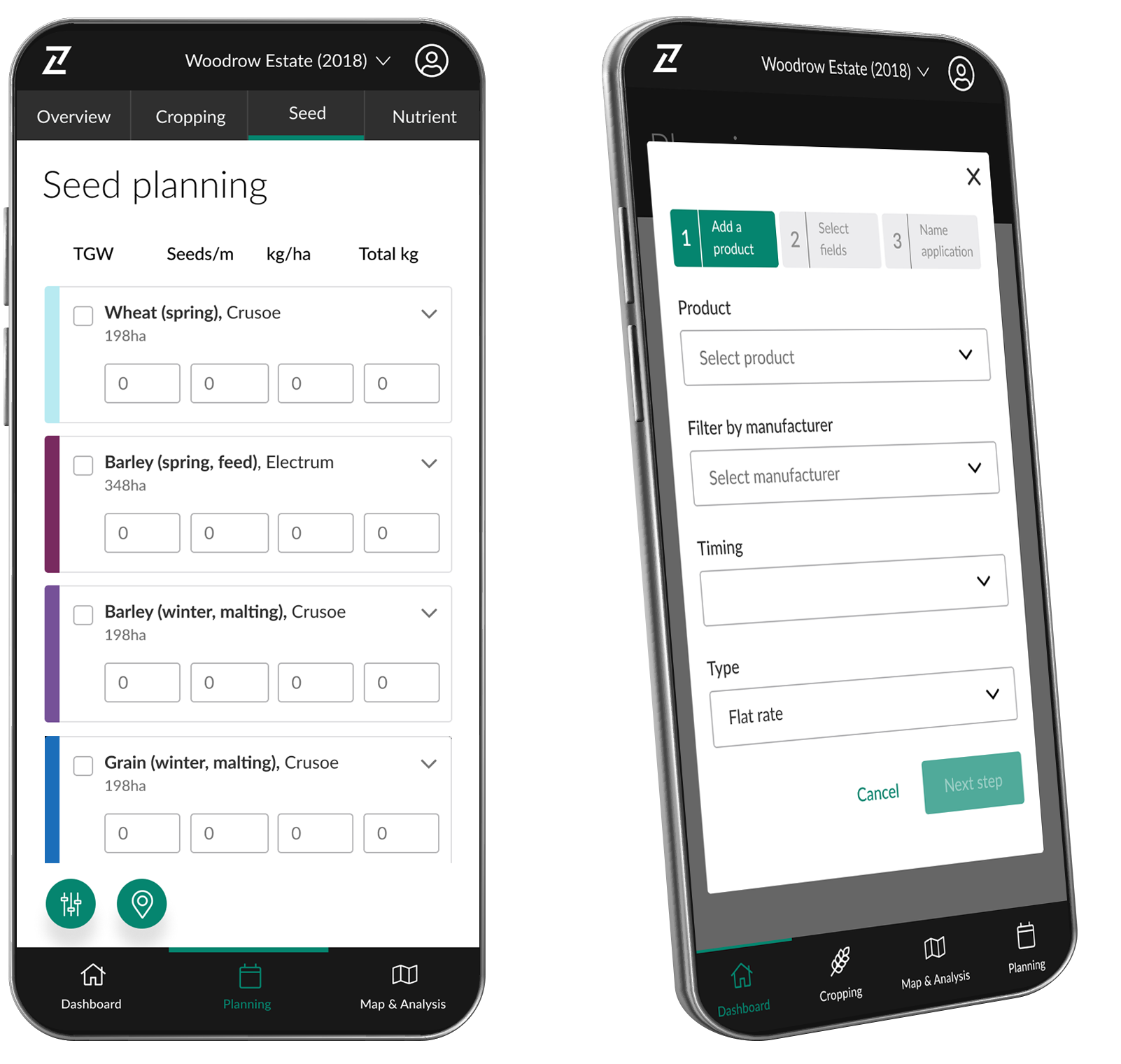
January 2023 User management
The problem
User were working with a very complicated legacy model to add new users. It was complex and very hard to understand. We wanted to supply a more intuitive user experience where all the actions live in one page rather than sending the user all over the system.
The solution
We did hours of A/B testing on solutions and came up with a single page user management tool.
How I helped
I spent hours in workshops with users understanding their pain points and frustrations.


June 2022 Bulk CSV ingest
The problem
Our users were migrating from other systems to get their assets into the Preservica system. They needed a fast way to add metadata to all the assets fast. We had 3 months to build a solution which would accommodate all our use cases all in one feature.
The solution
After endless brainstorming sessions and 20 user journeys and prototypes we finally solved it. We could utilise the existing API's off the legacy system. This meant we didn't need to rely on core released which happened every quarter.
How I helped
I did careful analysis of the API's in the core system and came up with a compromise (and no not a compromise for the user) which made engineers happy and we delighted our users with an easy to use bulk CSV metadata feature.


May 2022 Metadata management
The problem
User have no way of adding their own templates of metadata to attach to assets in the collections. They wanted to be able to use a simple intuitive GUI which allowed them to either add the fragments manually or by using a CSV template.
The solution
I created a user journey which would delight the users and speed up their collection creations.
How I helped
I spent months with engineers working out what API's we had which could be leverage and which new ones we needed the core team to build.


March 2021 New public portal
The problem
The old public portal was built without any UX influence and the configuration was very hard for the user to navigate. The user needed a solution which allowed them to showcase their collections to the public. They needed a portal which would give their viewers an easy, quick way to discover and search.
The solution
We spent months looking at solutions we could use and decided we needed to build this inhouse. Our problem we were trying to solve was very unique.
How I helped
Using the Diamond Theory and Lean UX process I was able to identify the constraints our customers had when setting up their portals. I spent months in workshops with our various persona groups of users. I solved all their needs in one simple portal design. The main focus was discovery and search and the ability to have a AI system which picked up trends of their users.

February 2021 Portal configuration tool

What I have learned from this project?
Simplicity is strength. As a designer, we are often lured by attractive, trendy and out of the box designs. But, We must always remember the ‘why’. The primary goal is to understand the user, their problems and then come up with a design that solves it. Process is essential. For a project that is vast, it gives you a roadmap to navigate through what can be a foggy route. This is especially useful when you’re starting out.
Other case studies
Other case studies
02
LEAD UX DESIGNER AND ART DIRECTION
Leading the digital transformation of farming
2018 - 2019
Led the UX of all AgSpace’s user interfaces. Managed UX direction across teams in a Scrum of Scrums Agile process. I designed the new administration tool which manages content, user access and satellite image editing across 3 platforms.
Take the journey with meToolset used:
03
Lead UX/UI DESIGNER
Creative direction for building a competitive channel marketing application
2014 - 2018
As the first designer at Zift I built a team of designers and front-end developers, designed the style guide & design system and crafted a standout site experience.
Take the journey with meToolset used:
