Client
Project
LEADING THE DIGITAL TRANSFORMATION OF FARMING
Project length
9 Months
RESPONSIBILITIES
Lead UX Design
UI designer
Web Design
Art Direction
Data analysis
- Other case studies:
- Preservica
- AgSpace
- Zift Solutions
The challenge
My task was to design an intuitive interface (Contour, Contour Mobile and Grid) for farmers and agronomists using a user-centric approach to seamlessly connect their business with thousands of farms to help them grow and increase yield. I conducted user interviews, ran workshops with the developers and translated ideas from our commercial team into design briefs. We enabled our users to set up cropping, create seed planning, predict yield and nutrient plans. They will have the ability to visualise data through dashboards and view analysis through an interactive map.
Contour would replace the legacy application which left the users frustrated and unable to complete a simple task. Contour was gaining momentum in the industry and the need for a more innovative UX and data visualisation was imperative for their next phase.
The new application increased conversion rates within 3 months of implementation. A huge part of our customers were based in developing countries, such as Africa, therefore careful consideration for speed was especially necessary.
There was a need to build a style guide with design tokens and component library to ensure a cohesive look and feel throughout the application.

Project goal
Create beautiful designs to visualise their big data.
Create easy to use seed planning applications.
Allow users to access statistics from powerful dashboards.
Create a mobile app which can be accessed out on farms to gather soil analysis and various other metrics.
Recommend nutrient management to enable farm profitability whilst looking after the environment and being compliant with regulations.
Enable the ability to create application timings and crop management.
Style guide using Figma
Atomic consistency
One of the first things I did was create a style guide with reusable components to keep the wireframes consistent. This was an important tool to enable faster wireframe mockups and for the development team to use and build an atomic application. I created a SASS stylesheet of design tokens, for the developers to use, along with a style guide built using Angular.

Key focus areas
What are the challenges or barriers with app use & adoption?
What’s important for a great app experience?
What are farmers needs and unmet needs, both online and off?
Lo-fi prototype feedback
What are the challenges or barriers with app use & adoption?
What challanges do farmers face when using the mobile app?
How are customers interacting with their app out on the farms?
User flows
I created user flows for each project to enable faster design iterations. As a UX designer for AgSpace one of my roles was to gather the business requirements from the commercial team.
Once I had an understanding of what was required and how we could tie this into our current product I created detailed user flows. Once these had been defined I would sit down with all stakeholders including the core development team to get signed off.

Design Exploration
The Design Exploration was essential to my process and helps to define the visual language for the new project. This is something that I’ve evolved over the years adding context, interaction, user experience, tone of voice and brand story.
After talking to the farmers and agronomists I gained a better understanding of their frustrations and business goals, we explored ways to best visualise their requirements and get the best out of the big data. This got us aligned on the big picture early and lets us make changes efficiently.

Dashboard
Created a dashboard customised to every farmer and agronomist. Advising the user on pests and diseases which can compromise yield. Alerting users on actions to take when they didn't set up a cropping or nutrient plan. Showing weather predictions giving the user easy access to make decisions.
Defining the MVP
Through close collaboration with the commercial team we were able to create a hand over process which defined the final product requirements into two phases.
Phase 1
How to design the MVP to allow the decommision of the legacy application.
Phase 2
Enhance the UX by doing further research into how we can create a more intuitive flow.
Seed planning
This hi-fidelity wireframe was designed to give farmers greater agronomic benefit from variable rate planning coming from variable seed application. Knowing the correct drilling rate to use is very difficult - by including seed planning in our platform it creates the opportunity for AgSpace to create algorithms to help the farmer/agronomist know the best rate to use.
This will allow existing toolbox customers to move to Contour. It allows new customers to create variable seed rate plans, adding value to them, and encouraging them onto higher margin versions of our service.

Colour palette
Primary colours
Secondary colours

Custom products
This hi-fidelity wireframe was created to allow users the ability to add custom products. This enabled the user to have more control of their variable rate planning.
I created various wireframes and interviewed users from Africa and Europe. This was the simplest way to represent the nutrients options whilst still considering the data integrity.
Research methods
Customer interviews
Market research analysis
Prototype testing
Customer journey
Persona gathering
Surveys and questionnaires
Requirements gathering
Low-fidelity and high-fidelity Wireframing
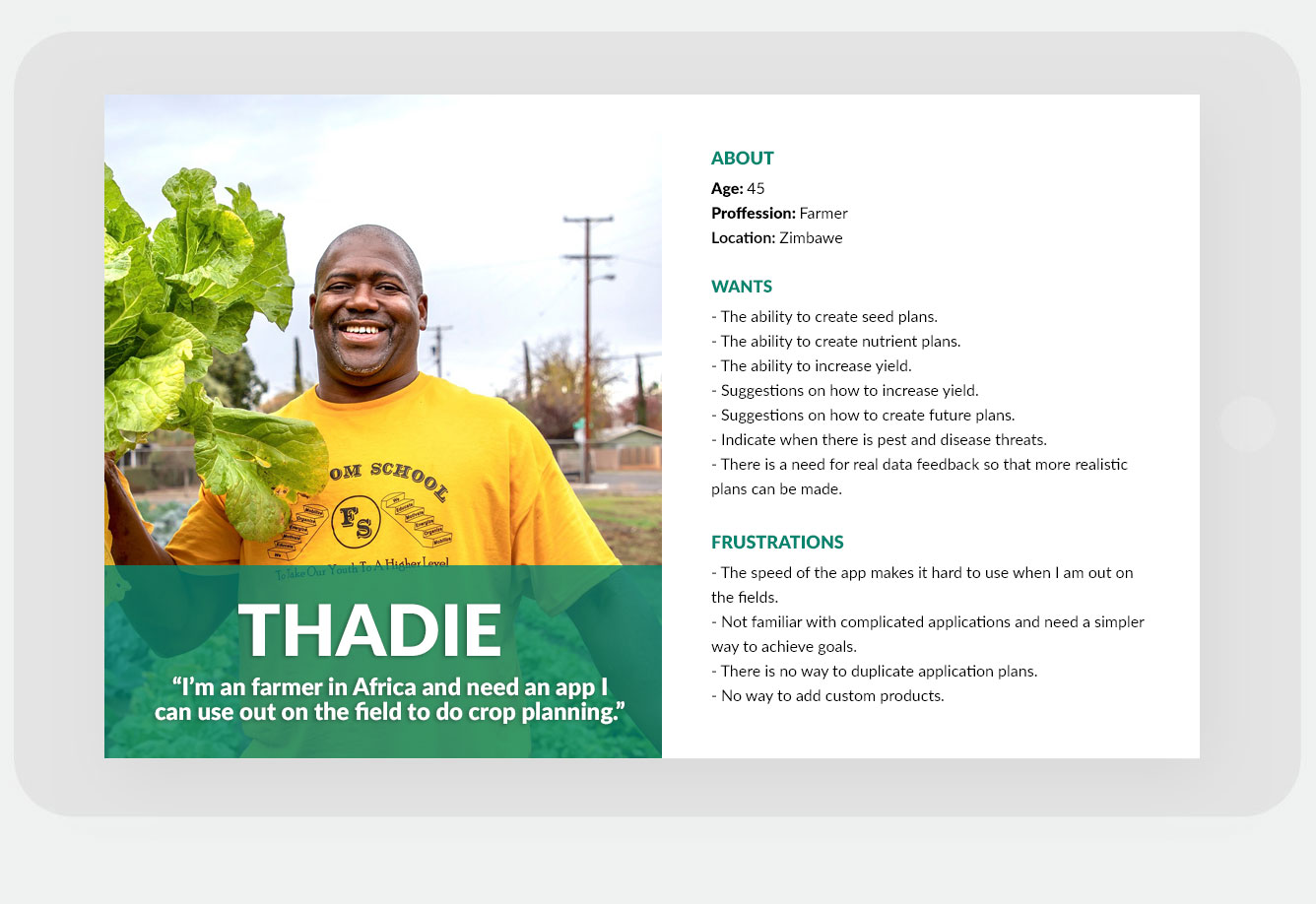
Personas
I identified that there was no documented evidence of user research. I conducted user surveys and discussed the needs of the business with stakeholders and developed a set of persona decks. These were used to make UX decisions when building out design requirements.
What we learnt
Seek critical feedback early
Despite the close collaboration between design and build, there could have been more honest conversations had early on when defining the MVP. Our ambition blinded us early, which resulted in inadequate time for build feedback and a premature release.
We also learnt that it is imperative to have a well defined roadmap and that the business needed to adhere to the goals they had set out to define. Changing direction in the company objectives can be disruptive to the quality of product development.

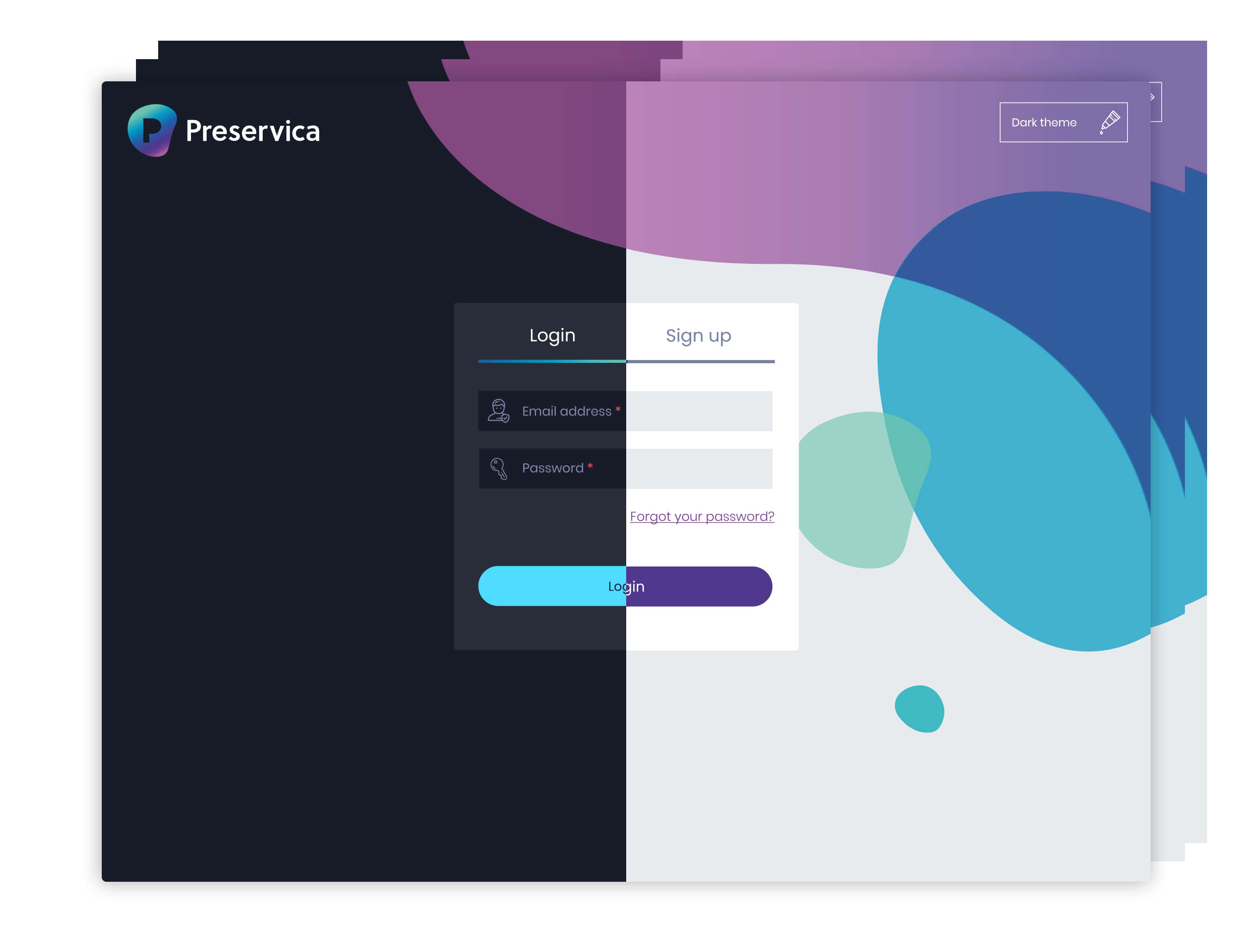
Log in screen
I designed a few iteration of the log in screen and this is the one that was chosen. The design consisted of an area to log in or register. AgSpace wanted to promote future features so I integrated a carousel into the right side of the design.
Email signitures


Life cycle emails
I designed a set of email communcation email templates which would be used throughout the system. I designed, developed and tested these with a focus group along with the user flow wireframe.

Other case studies
Other case studies
01
LEAD UX DESIGNER CONSULTANT
Reshape the landscape of digital preservation
September 2019 - current
A more advanced system which allows archivists a simpler, faster way to preserve their content.
Take the journey with meToolset used:
03
Lead UX/UI DESIGNER
Creative direction for building a competitive channel marketing application
2014 - 2018
As the first designer at Zift I built a team of designers and front-end developers, designed the style guide & design system and crafted a standout site experience.
Take the journey with meToolset used:
